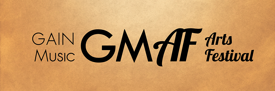
GAIN Music Arts Festival Wordmark (2016)
February 2016
GAIN Music Arts Festival – Poster
Designed by Dane Aleksander with Adobe Phototshop and Serif Affinity Photo.
Poster Art (Year 6)
Graphic art for the 6th annual GAIN Music Arts Festival—the biggest festival GAIN Music has put on to date: 6 days, 10 venues, over 25 acts. The commission was to fit it all on a poster, and to showcase downtown Guelph, Ontario, in the style of an 18th to 19th century handbill and map. We started the process by identifying the typeface used in the GAIN Music wordmark and, with limited time, we looked to key imagery from earlier years to quickly build a core visual language for GMAF 2016. The sans serif typeface used in the GAIN Music wordmark was Sawasdee; it's simple, and its simplicity balanced well against Lobster, the more extravagant typeface used in some of the subtitles in the 2015 festival artwork. The Lobster typeface was extended to all festival titles in 2016, in particular the title case: “Arts Festival”, plus its acronym, “AF”, as it appears in the lettermark. The other acronym in the lettermark, “GM”, is actually typed in a typeface named: Tw Cen MT, a typeface that has proved to mimick the style of Sawasdee but with a heavy font-weight that better balanced the dynamic letterforms of the second half of the lettermark. As it appears in the festival title mark, “GAIN Music” remains typed in Sawasdee.
We used icons for festival venues on the map. The iconography consisted of simple shapes with splashes of color, like ink spots on the 18th century canvas. These colored highlights were treated as a layer on the map, and the contrast was muted as it appears in context as the background of the poster. A handbill served as a schedule of events, with the map in full-color on the reverse side.
The GAIN Music wordmark serves as a visual compliment to the festival title mark, so, the corporate default typeface was extended to use in paragraphs and event details, to connect the production company with the festival materials. These included the event poster and handbill / schedule, tv spot, web spot, lanyard, and so on. The extended and limited use of the two typefaces brought consistency to the graphic campaign for GMAF, for 2016 and years to come. This helped to reinforce the identity of GAIN Music in the GMAF lettermark as well as to connect the lettermark with the festival lettering, and this encouraged clarity and recognition of both the production company and the Arts Festival as an intergrated part of an annual lineup as presented by GAIN Music.
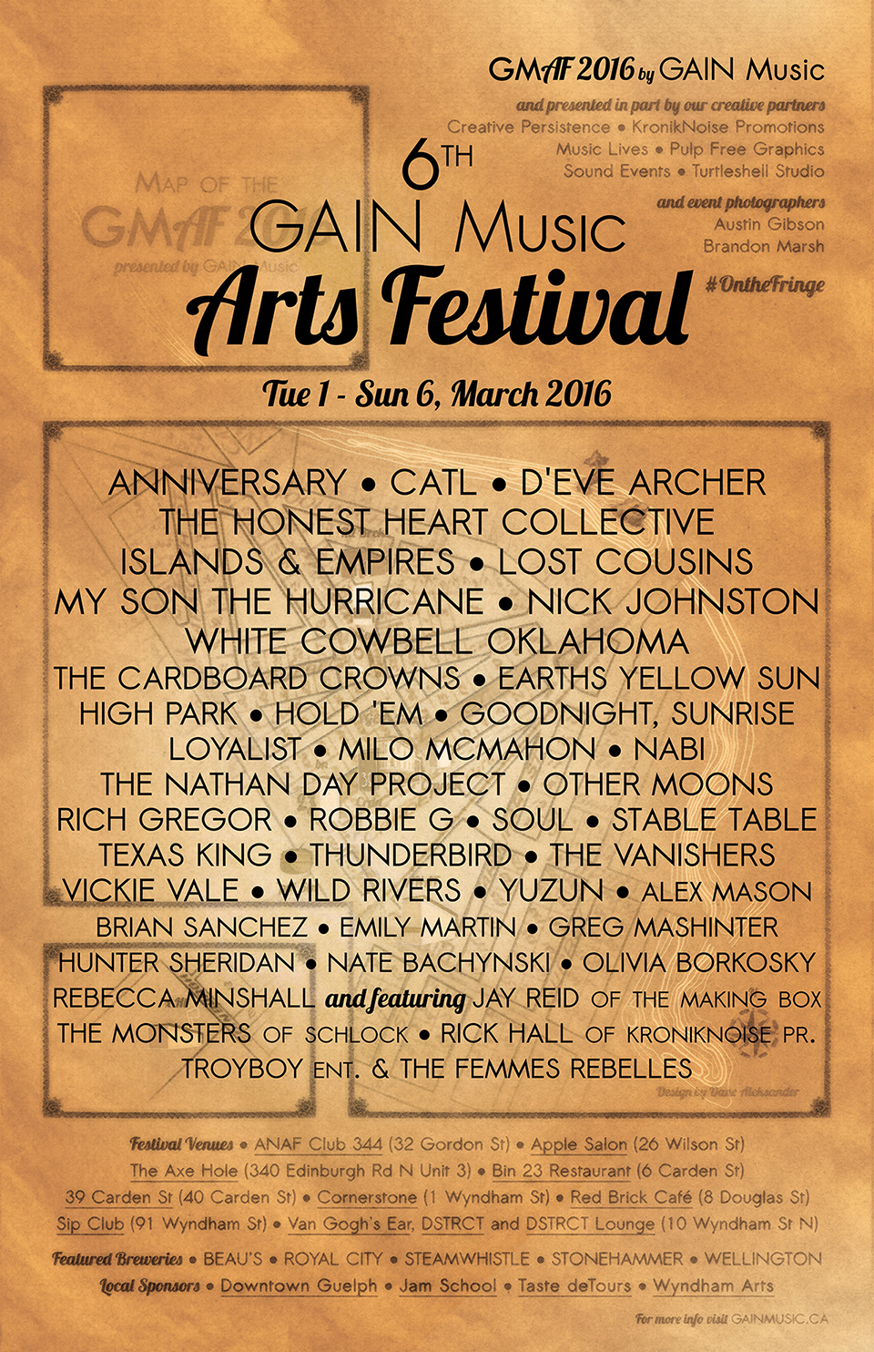
GAIN Music Arts Festival 6 Poster (2016)
Poster Art (Year 7)
The poster for the 7th annual GAIN Music Arts Festival (GMAF) was based on the same 18th to 19th century-style map of downtown Guelph that was designed in 2016 for the 6th year of festival. This year, the iconography has the added historical context of celebrating Canada’s semicentennial, plus Guelph’s 190th. This included three changes. One. The Basilica of Our Lady Immaculate in Guelph, which opened six decades after the city was founded (two decades after the country was founded), stands as an historic and iconic emblem of Guelph today, and is presented in the poster in celebration of the art history (architecture) of the aged Canadian city. Two. There is an added date on the map that pins its 18th to 19th century-style on the founding of the city of Guelph: April 23, 1827. Three. There is an homage to the Canada's 1967 Centennial logo, designed by Stuart Ash, featured in a corner of the poster and handbill.
The existing iconography for festival venues was abstracted further to allow visual space for the addition of the posterized basilica and other graphics. The venue icons were made to rely more on the idea of ink spots on canvas, with a mirrored set of colored spots in a legend on the map.
Canada's 1967 Centennial logo was more prominently adapted in the teaser graphic for the 7th annual festival (in place of a graphic of the compass, from the map, from year 6, which was placed within the counter of the ‘6’).
There was an update to Canada's logo made specifically for this semicentennial, but its image was in part tarnished by a mismanaged creative process. According to a CBC News report in 2015, there were five proposed designs created in-house at Canadian Heritage in 2013, and tested on nine focus groups (at a cost to taxpayers of forty-thousand dollars). Canadian Heritage later abandoned the in-house project, ignored the professionals, and instead launched a contest for students, with $5,000 for the winner. Stuart Ash, now revered as a design pioneer in Canada, was reported as critical of the winning logo, but equally dismissive of the Harper government's approach to arriving at a final design:
“Treating the 150th anniversary without a strategic base and not commissioning a strategic design concept from the best design firms is a missed opportunity. […] It illustrates how politicians are not in touch with the realities of the marketplace. […] To not place any value on the significance of this opportunity is truly an oversight politically.” — Stuart Ash, designer of Canada's 1967 Centennial logo, in a CBC News report in 2015 [1]
Canada's 150th birthday needs a symbol, Ash said, “to communicate a bold memorable idea that upon first impression captures the viewer's attention and is paramount in establishing the basis of a strong brand”. He notes that the federal government also launched a logo contest in the early 1960s, but abandoned the idea after submissions proved to be “banal, predictable or clichéd.” A firm that employed Ash was later hired to do the job, and the rest is design history.
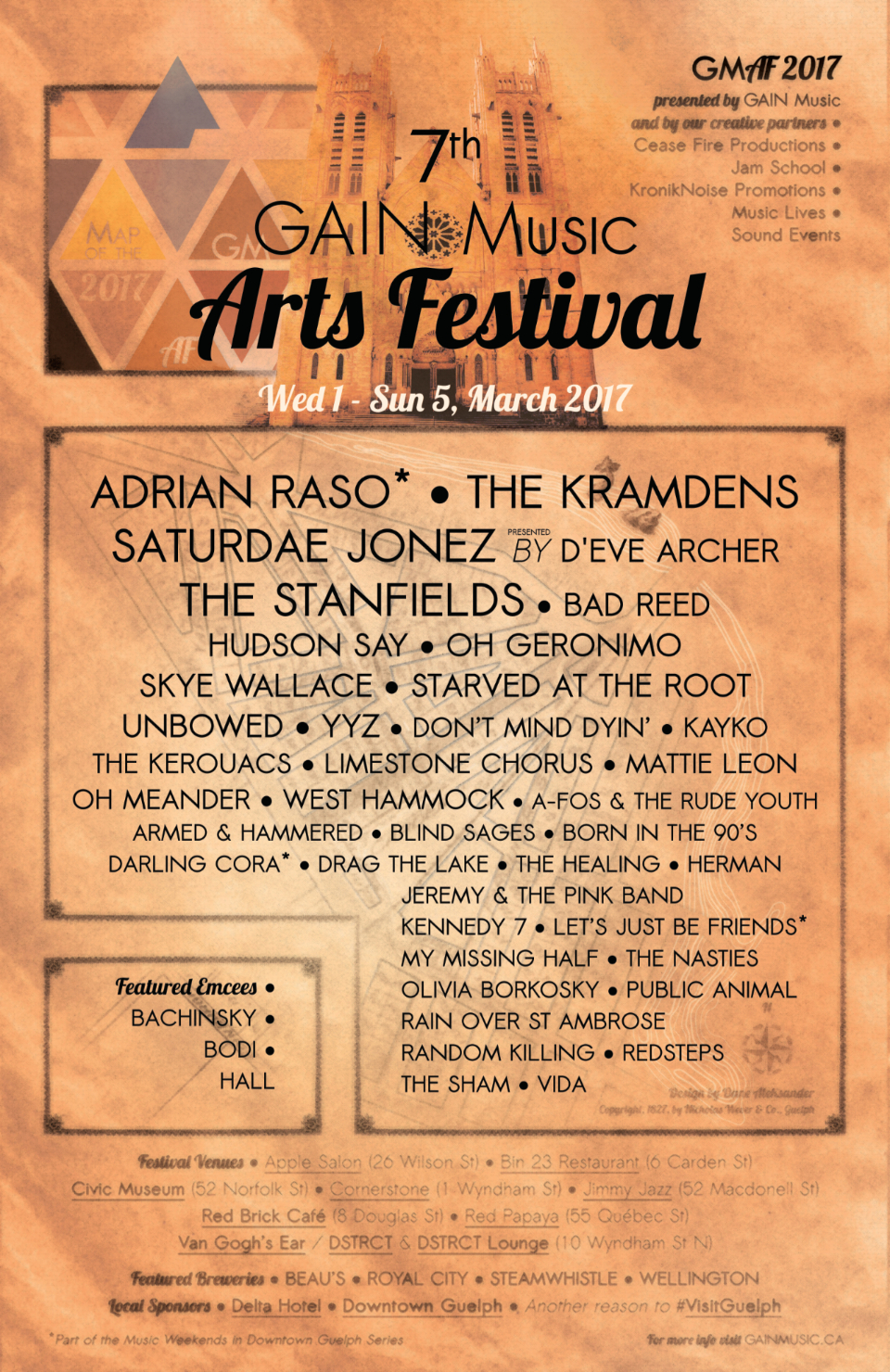
GAIN Music Arts Festival 7 Poster (2017)
1 CBC News. Report by Dean Beeby: Canada 150 Logo called confusing by Centennial logo creator, 2015. Website Link
This project page is concluded and is archived as a case study.
Client Team
Nik Wever.
Iconography
19th century style map and handbill;
Canada's 1967 Centennial logo by Stuart Ash.
Basilica of Our Lady Immaculate in Guelph.
Typography
Default: Lobster 1.4 (2010) principally by Impallari Type; Sawasdee (origin unknown); Tw Cen MT or 20th Century (1936-47) by Sol Hess.