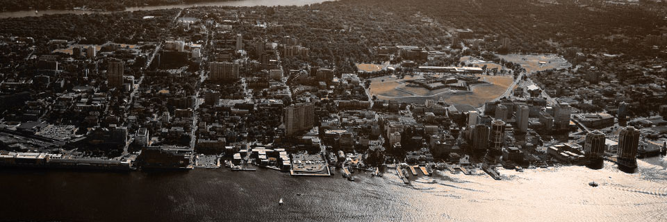
Halifax, Nova Scotia
November 2016
Boom12 – Logomark
Designed by Dane Aleksander with Adobe Illustrator.
Mark for Halifax-based design company with focus on local politics—Boom12 wanted a redesign of an atomic-looking graphic mark that lived alongside the Boom12 wordmark. The existing mark (below) was described to me as science-y, stale and unappealing. The identity of the company was misrepresented as an atomic boom and, instead, was intended as a shout-out to the bang of the noon gun.

Boom12 mark (before)
The company wanted something more playful.
Behind the Boom12
The task was specifically framed as a refresh of the graphic mark. To this point, the company did not have a mark that stood on its own, so any first impression of the graphic mark was seen alongside the wordmark, and my first impression was that the two together read: ‘bang-boom-twelve.’ Well, at first, it unclear whether the numbers were meant to read: ‘boom-one-two’ or ‘boom-twelve’—at first, it did not matter because the wordmark was not a problem, however, it was undoubtedly part of a solution. While I would later make the connection between “boom-twelve” and its reference to the noon (twelve o'clock) gun on the Halifax Citadel, my earliest thoughts on its redesign were focused on the identity as a whole. I thought, maybe, we did not need a graphic at all.
![[Archives] (2016) © Dane Aleksander](../../inc/img/copy/boom12/boom12-wordmark-casestudy.jpg)
Boom12 wordmark case study (2016)
I was considering design as a solution to render the “one-two” more individualized, which, of course, did not pan out but did snowball into an exploration of variation in weight and color in the “boom” text, in an effort to make the word feel more expressive within the constraints of the existing typeface: Raleway. For reasons made clear, the “one” and “two” were reverted to a unified look, to read collectively as “twelve”. The line of thought, however, which concluded with “boom” typewritten in a descending progression of weights, meaningfully exercised the range of the typeface and emphasized the onomatopoeic nature that is inherent in the word.
This design of the wordmark takes advantage of the negative space—the sequence of counters in its first three characters: “b”, “o” and “o” to direct the eye through the word. The wordmark stands on its own as is. It might also be made more clear if the counters were pushed past the constraint of default letterforms of the typeface; furthermore, another typeface might express the sentiment more clearly. This was a simple design solution that was presented along with a redesign of the graphic mark in its own respect.
![[Archives] (2016) © Dane Aleksander](../../inc/img/copy/boom12/boom12-wordmark-light.png)
Boom12 wordmark (2016)
I figured that the visual identity of Boom12 should be representative of the passion that the company presents for its design and political strategy in Halifax, with the hope that the mark might come to represent something for the company as well as to reflect value in the company's identity from the perspective of a likely local, prospective client looking onward. I wanted a story-driven design solution, one that might better represent the bang of the noon gun.
It did not take long to find a bangin' visual.
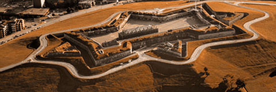
Citadel, Halifax, Nova Scotia
![[Archives] (2016) © Dane Aleksander](../../inc/img/copy/boom12/citadel-mark.jpg)
Citadel logomark (graphic pencil, 2016)

Boom12 Citadel logomark (2016)
Making the Boom Logomark
Its eight-pointed silhouette with its four-triangle counter shape – cut out shape within – with three of the triangles separated from a central quad, forms the basic structure of the Halifax Citadel. The central quad with the one triangle attached, together, forms a pentagon shape, which in turn has the five-pointed star as a natural counter. Using the counter of a Raleway Heavy “o” as a guide, the star was sized, centered, and anchored on the mark like a capital city-star on a map. The relative placement and size of the graphic and wordmark, like the progression of character weights, was rooted in guidelines inherent in the typeface. This helps to make the mark look like it belongs in its place, like its star-shaped counter is the first in a natural progression of the “boom” theme that is continued in the counters of the letterforms. The mark now has inherent meaning and may come to represent the company with and without the wordmark.
Boom12 mark (2016)
Color treatement was not included in the scope of this project. Color values are previewed from a previous iteration of the mark. This project page is concluded and is archived as a case study.
Client Team
Scott Gillard.
Iconography
Citadel Hill (Fort George) in Halifax.
Capital city star (on map).
Typography
Default: Raleway (2012) principally by Impallari Type.