April 2017
Toronto Organizing – Logomark
Designed by Dane Aleksander with Serif Affinity Designer.
This case study presents a revised and unpublished logomark. The commission resulted in a design more along the lines of a two-line wordmark. For better or worse, the typographic direction eschewed the style of Sul Sans and ended with a more widely platformed Web font. That result is not presented here—here is the alternate design in Sul Sans.
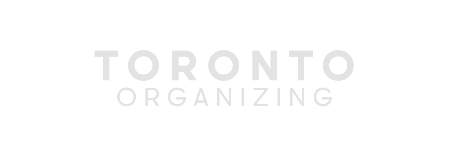
Toronto Organizing – Wordmark: Two-line (unpublished)
Sul Sans is a geometrically constructed typeface with features found in capital letters on signs and shops in Portugal. The typeface was published in 2016 by Rui Abreu. The world of graphic design has become familiar with Azo Sans, a similar typeface designed by the same typeface designer, when that similar typeface was made available to members of the Adobe Creative Cloud community through Typekit (now called Adobe Fonts).
Azo Sans is a geometrically constructed typeface, like Sul Sans, with even more adherence to the elementary forms and without any of the so-called “southern European flavour.” Most notably, in this case, Azo Sans has gained such widespread use as to have become familiar to the city of Toronto through its appropriation in the city-namesake three-dimensional installation in Nathan Phillips Square.

‘Toronto Sign’ CC BY-SA 2.0 (2019) [Link, cropped, recolored]
Sul Sans invokes this in vogue branding of the city, while incorporating some design details that will distinguish a visual identity as distinct. Such adherence to elementary forms in Azo Sans, in particular, leaves the letterform of the letter ‘N’ in a widened, squared shape. Whereas, in Sul Sans, the letterform of the letter ‘N’ is less square, more narrow and, so, more aligned with the width of the letter ‘R’ letterform. In the case of this logomark, in Sul Sans, that better alignment helps add to a visual harmony in the arrangement of letters.
The design of this logomark adheres to the perfectly square framework of a three-by-three bookshelf. A little cubby shelved with big, block letters. And each letter assigned a cubby. The arrangement of the letters ‘O’ makes clear a visual theme of organization. And the happenstance of three very geometric letters ‘O’ in a row in the logomark playfully invokes another three-by-three grid system—a successful game of tic-tac-toe.
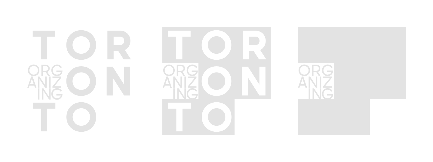
Toronto Organizing – Logomark: Regular, Black, Block (unpublished)
With all these themes of organization expressed visually, already, the word ‘ORGANIZING’ in the wordmark may be superfluous. At a minimum, its legibility may be sacrificed in favor of furthering the theme of this design. There is an added satisfaction that comes with organizing, so to speak, the added word in the wordmark. The logomark design, implicit in its arrangement of the letters, makes the identity of the brand explicit.
A block version takes this direction so far as to exclude the letters that spell out the name of the city.
An alternate, less compact, yet less complicated version of the logomark favors legibility. In any case, the structure of its design creates a space for themes. This case study also bounces around that idea.
Toronto Organizing – Logomark, alternate: Regular, Black, Block (unpublished)
The abstraction of the block version serves the possibility of two specific outcomes. Either, success of the company at a local level has elevated brand recognition, which allows for more manoeuvrability in design. Or, success of the company at a local level has expanded service to locations outside of Toronto. The block version of the logomark design allows for the possibility that other city names may be creatively set in the cubby bookshelf, while preserving a common sense of visual identity.
Client Team
Liz Wanless.
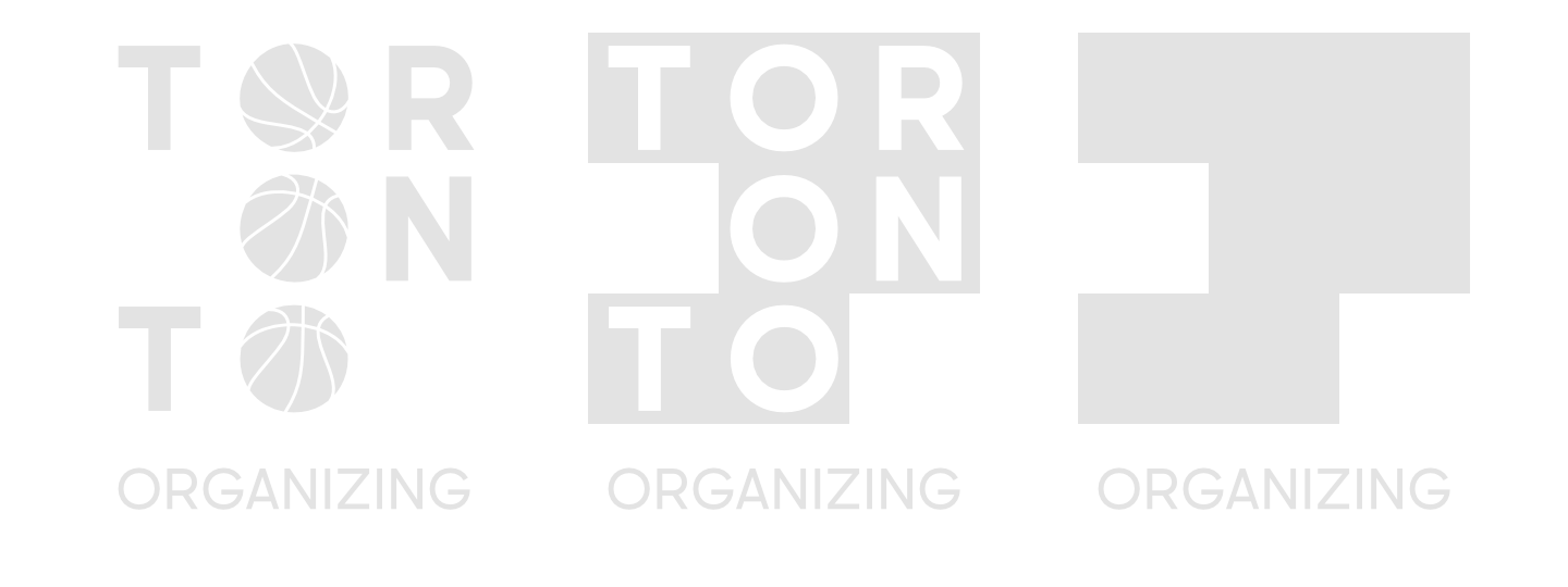
Iconography
A relation to the typography of Azo Sans, a cubby bookshelf, and a tic-tac-toe.
Typography
Default: Sul Sans (2016) by Rui Abreu.
Website
Company Website: torontoorganizing.com [offline].